In today’s data-driven economy, analytics platforms aren’t just about dashboards — they’re about enabling smarter, faster decisions that fuel real business growth with ROI. Choosing between Qlik Sense (on-premise) and Qlik Cloud (cloud-native) isn’t simply a technical debate — it’s about how your organization can maximize ROI from data.
At Arc Analytics, we help businesses navigate these decisions daily. This guide breaks down the strengths of both Qlik options, showcases where Qlik Cloud creates new opportunities, and explains how a hybrid approach might unlock the best of both worlds.
The Core Difference: On-Premise Control vs. Cloud Agility
Qlik Sense (On-Premise): Best suited for organizations with strict security, compliance, or legacy systems. You retain full control over infrastructure while enjoying Qlik’s powerful associative data engine.
Qlik Cloud (Cloud-Native): A flexible, continuously evolving platform that delivers scalability, accessibility, and advanced analytics. Updates roll out automatically, reducing IT overhead and giving teams instant access to new features.
This core choice — control vs agility — frames today’s analytics strategies.
Why Businesses are Moving to Qlik Cloud
Qlik Cloud isn’t just Qlik Sense in the cloud. It’s a next-generation platform designed to enhance ROI and reduce friction in just about every phase of analytics.
🚨 Proactive Insights with Qlik Alerting
Set real-time, data-driven alerts to act the moment thresholds are crossed or anomalies appear.
📊 Advanced Qlik Reporting Suite
Automated, polished, and customizable reports that ensure insights are delivered to the right people, exactly when they need them.
🔄 Drag-and-Drop Data Flows
Reduce IT bottlenecks with visual data preparation for analysts and business users — no heavy scripting required.
👥 Seamless Collaboration
Enable true real-time co-authoring and dashboard sharing across teams, locations, and devices.
📈 Elastic Scalability
Scale instantly to meet spikes in data volume or user demand. No more waiting on hardware expansions.
🔒 Enterprise-Grade Security
Far from being a risk, Qlik Cloud meets rigorous security standards, often exceeding what smaller enterprise IT setups can provide.
🤖 AI + Machine Learning Insights
Go beyond dashboards with AI-powered predictions and ML-driven insights.
🌍 Broad Data Connectivity
Unify cloud and on-premise sources into one analytics environment.
Unlocking ROI with Automation, Qlik Answers, and Qlik Predict
One of the most transformative ROI drivers in Qlik Cloud is the ability to automate and modernize how users interact with data:
Qlik Automation connects processes, apps, and triggers, removing manual tasks from your team’s workload.
Qlik Answers lets users ask questions in natural language and get instant, contextual insights — expanding analytics adoption to the entire workforce.
Qlik Predict leverages machine learning to forecast trends and give businesses predictive power, not just reactive dashboards.
These SaaS-native tools go far beyond cost savings — they unlock entirely new value streams, driving adoption, speeding decisions, and creating competitive differentiation.
Migrating from Qlik Sense to Qlik Cloud can be daunting without the right expertise. This is where Arc Analytics’ Qlik Migration Services give you a competitive edge.
We specialize in:
Ensuring zero downtime migration.
Rebuilding complex Qlik apps in the cloud for performance gains.
Training teams for success in Qlik Cloud environments.
Notably, Qlik itself recently launched the Qlik Sense to Qlik Cloud Migration Tool (May 2025), giving organizations an official, streamlined path to migrate apps, data connections, and user roles. We combine this tool with our strategic approach for the smoothest possible transition.
Hybrid Approaches: Best of Both Worlds
For many enterprises, the smartest path isn’t choosing one — it’s choosing both.
Keep sensitive workloads in Qlik Sense on-premise for compliance.
Use Qlik Cloud for innovation, new projects, or global accessibility.
Minimize costs with licensing options that allow a hybrid setup at only ~30% additional cost.
This approach unlocks incremental ROI without forcing a “rip-and-replace” investment.
High-Level Licensing & ROI Comparison
Feature/Model
Qlik Sense (On-Premise)
Qlik Cloud (SaaS)
Licensing Model
Core-based (per CPU/core)
Capacity-based (data volume & users)
Infrastructure Costs
Requires hardware, maintenance, IT resources
Included in subscription (no infrastructure overhead)
Scalability
Limited to available cores & hardware
Elastic, scales on-demand
Updates & Upgrades
Manual patching & downtime
Continuous updates built-in
Security & Compliance
Controlled on-prem, internal governance
Enterprise-grade, built-in compliance frameworks
Total Cost of Ownership
High upfront + ongoing infra costs
Predictable subscription, pay for usage
ROI Focus
Infrastructure investment heavy
Data-driven outcomes & business agility
Takeaway: With Qlik Sense, ROI is partly consumed by infrastructure cost and IT overhead. With Qlik Cloud, that same investment is redirected toward automation, innovation, and user adoption — where business ROI is truly measured.
The ROI Equation
Migrating to Qlik Cloud doesn’t replace your past Qlik investment — it amplifies it. By combining proactive alerts, advanced reporting, Qlik Automation workflows, Qlik Answers for natural language analysis, and Qlik Predict for machine learning insights, companies can:
Improve decision-making speed.
Reduce IT overhead and manual reporting.
Empower every department with data-driven culture.
Stay future-ready as Qlik continues innovating.
Ready to Maximize Your Qlik ROI?
Whether full migration or hybrid, Arc Analytics is your partner in unlocking more value from Qlik.
While the Qlik platform has maintained and supported libraries developer libraries in JavaScript and .NET/C# for several years, they have more recently released a library for interacting with Qlik in Python. They call it the Platform SDK, which is also available as a TypeScript library.
The Python library is essentially a set of Python classes and methods that mirror the structures and functions of the Qlik QRS and Engine APIs, also providing some conveniences around authentication and WebSocket connections. The library is open for anyone to download and use thanks to its permissive MIT license.
The use cases for the Qlik Python SDK include being able to write automation scripts for repetitive admin tasks, load app and object data into a Pandas dataframe, and even creating reports built off of app or log data.
Installing the library is very simple — just make sure you are using at least Python 3.8:
python3 -m pip install --upgrade qlik-sdk
Let’s look at some examples of how we can use the library. Below, we import a few classes from the qlik_sdk library and then create some variables to hold our Qlik Cloud tenant URL and API key. We’ll use the API key to authenticate with a bearer token but an OAuth2.0 implementation is also available. Learn how to generate an API key here. The tenant URL and API key are then used to create an Apps object, which provides some high-level methods for interacting with app documents in Qlik Cloud.
from qlik_sdk import Apps, AuthType, Config# connect to Qlik enginebase_url ="https://your-tenant.us.qlikcloud.com/"api_key ="xxxxxx"apps = Apps(Config(host=base_url, auth_type=AuthType.APIKey, api_key=api_key))
Now that we’ve got our authentication situated, let’s add some code to interact with a Qlik app and its contents. First, let’s import a new class, NxPage, which describes a hypercube page (more about Qlik hypercubes here). Then let’s create a new function, get_qlik_obj_data(), to define the steps for getting data from a Qlik object, like a table or bar chart. In this function, we can take an app parameter and an obj_id parameter to open an WebSocket connection to the specified app, get the app layout, get the size of the object’s hypercube, and then fetch the data for that hypercube:
from qlik_sdk.apis.Qix import NxPageapp = apps.get("xxxxxxxx-xxxx-xxxx-xxxx-xxxxxxxxxxxx")def get_qlik_obj_data(app: NxApp, obj_id: str) ->list:"""Get data from an object in a Qlik app."""# opens a websocket connection against the Engine API and gets the app hypercubewith app.open(): tbl_obj = app.get_object(obj_id) tbl_layout = tbl_obj.get_layout() tbl_size = tbl_layout.qHyperCube.qSize tbl_hc = tbl_obj.get_hyper_cube_data("/qHyperCubeDef", [NxPage(qHeight=tbl_size.qcy, qWidth=tbl_size.qcx, qLeft=0, qTop=0)], )return tbl_hcobj_data = get_qlik_obj_data(app=app, obj_id="xxxxxx")
This code would end up returning a list of data pages, something like this:
The cell value is shown as 282 in the qText property. We may note, though, that we can’t readily identify the field that this value represents.
Let’s add some code to make the resulting dataset include the fields for each cell value. We can do that by adding a get_ordered_cols_qlik_hc() function to get the ordered list of columns in each of these NxCellRows items.
This function will ultimately take a straight hypercube as an argument and do the following:
Get the list of dimensions and measures and then combine them into one list.
Reorder that list to match the correct column order as defined in the hypercube’s qColumnOrder property.
Return that ordered column list.
Then in our get_qlik_obj_data() function, we use our new get_ordered_cols_qlik_hc() function to get our columns. From there we iterate through each row of each data page in the hypercube and create a new dictionary object for each cell and then adding those dictionaries to a list for each row.
New and updated code shown in bold:
from qlik_sdk.apis.Qix import NxPage, HyperCubedef get_ordered_cols_qlik_hc(hc: HyperCube) ->list:"""get ordered columns from Qlik hypercube."""# get object columns dim_names = [d.qFallbackTitle for d in hc.qDimensionInfo] meas_names = [m.qFallbackTitle for m in hc.qMeasureInfo] obj_cols = dim_names.copy() obj_cols.extend(meas_names)# order column array to match hypercube column order new_cols = [] new_col_order = hc.qColumnOrderfor c in new_col_order: new_cols.append(obj_cols[c])return new_colsdef get_qlik_obj_data(app: NxApp, obj_id: str) ->list:""""""# opens a websocket connection against the Engine API and gets the app hypercubewith app.open(): tbl_obj = app.get_object(obj_id) tbl_layout = tbl_obj.get_layout() tbl_size = tbl_layout.qHyperCube.qSize tbl_hc = tbl_obj.get_hyper_cube_data("/qHyperCubeDef", [NxPage(qHeight=tbl_size.qcy, qWidth=tbl_size.qcx, qLeft=0, qTop=0)], ) hc_cols = get_ordered_cols_qlik_hc(tbl_layout.qHyperCube)# traverse data pages and store dict for each row hc_cols_count =len(hc_cols) tbl_data = []for data_page in tbl_hc:for rows in data_page.qMatrix: row = {hc_cols[i]: rows[i].qText for i inrange(hc_cols_count)} tbl_data.append(row)return tbl_dataobj_data = get_qlik_obj_data(app=app, obj_id="xxxxxx")
This will get us the desired field: value format that will allow us to better analyze the output, like so:
One of the toughest aspects of dealing with freeform data is that the input layer may not have proper data validation processes to ensure data cleanliness. This can result in very ugly records, including non-text fields that are riddled with incorrectly formatted values.
Take this example dataset:
[Test Data] table
RecordID
DurationField
1
00:24:00
2
00:22:56
3
00:54
4
0:30
5
01
6
4
7
2:44
8
5 MINUTES
9
6/19
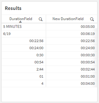
Those values in the [DurationField] column are all different! How would we be able to consistently interpret this field as having a Interval data type?
One of the ways you might be inclined to handle something like this is to use If() statements. Let’s see an example of that now.
It’s a mess! Qlik has to evaluate each Interval#() function twice in order to, first, check to see if the value was properly interpreted as a duration (“interval”) value, and then, second, to actually return the interpreted duration value itself.
One of the nice alternative ways of handling this is to use a different conditional function, like Alt(). This function achieves the same thing as using the If() and IsNum() functions in conjunction. You can use:
The preceding load happening at the bottom of that script is there to do some basic standardization of the [DurationField] field so that it’s easier to pattern-match.
In the rest of the script, we’re using the Alt() function (Qlik Help page) to check whether its arguments are numeric type of not. Each of its arguments are Interval#() functions, which are trying to interpret the values of the [DurationField] field as the provided format, like 'hh:mm:ss' or 'm:s'.
So it’s basically saying:
If Interval#([DurationField], 'hh:mm:ss') returns a value interpreted as an Interval, then return that value (for example, 00:24:00). But if a value couldn’t be interpreted as an Interval (like 5 mins for example, where the Interval#() function would return a text type), we go to the next Interval#() function. If Interval#([DurationField], 'mm:ss') returns a value…
This should all result in a table that looks like this:
In this post, I want to look at how to use a few of the built-in Qlik GeoAnalytics functions that will allow us to manipulate and aggregate geographic data.
Specifically, we are going to look at how to calculate a bounding box for several grouped geographic points, reformat the result, and then calculate the centroid of those bounding boxes. This can be a useful transformation step when our data has geographic coordinates that you need to have aggregated into a single, centered point for a particular grouping.
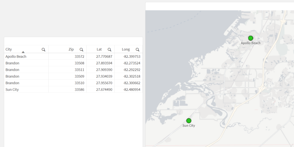
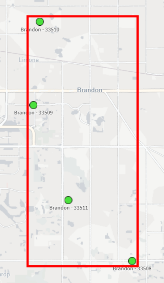
In our example, we have a small dataset with a few records pertaining to Florida locations. It includes coordinates for each Zip Code that is within the city of Brandon. Our goal is to take those four coordinates, aggregate them into a single, centered point, and then return that point in the correct format for displaying it in a Qlik map object.
Here’s our data, loaded from an Inline table:
[Data]:
Load * Inline [
State   ,   County          ,   City            ,   Zip     ,   Lat         ,   Long
FL      ,   Hillsborough    ,   Apollo Beach    ,   33572   ,   27.770687   ,   -82.399753
FL      ,   Hillsborough    ,   Brandon         ,   33508   ,   27.893594   ,   -82.273524
FL      ,   Hillsborough    ,   Brandon         ,   33509   ,   27.934039   ,   -82.302518
FL      ,   Hillsborough    ,   Brandon         ,   33510   ,   27.955670   ,   -82.300662
FL      ,   Hillsborough    ,   Brandon         ,   33511   ,   27.909390   ,   -82.292292
FL      ,   Hillsborough    ,   Sun City        ,   33586   ,   27.674490   ,   -82.480954
];
Let’s see what happens when we load this data and create a new map that has a point layer, using City as the dimension and the Lat/Long fields as the location fields:
What we may notice here is that the city of Brandon does not show up on the map — this is because the dimensional values for the point layer need to have only one possible location (in this case, one lat/long pair). Since Brandon has multiple Lat/Long pairs (one for each Zip Code), the map can’t display a single point for Brandon.
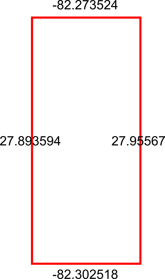
Okay, so let’s get the bounding box so that we can use it to get the center-most point. This is ultimately what we want our bounding box to be:
To do this in Qlik we’ll use the GeoBoundingBox() function, which calculates the smallest possible box that contains all given points, as shown in the example image above.
Here’s the script we can use in the Data Load Editor:
[Bounding Boxes]:
Load
    [City]
  , GeoBoundingBox('[' & Lat & ',' & Long & ']') as Box
Resident [Data]
  Group By [City]
;
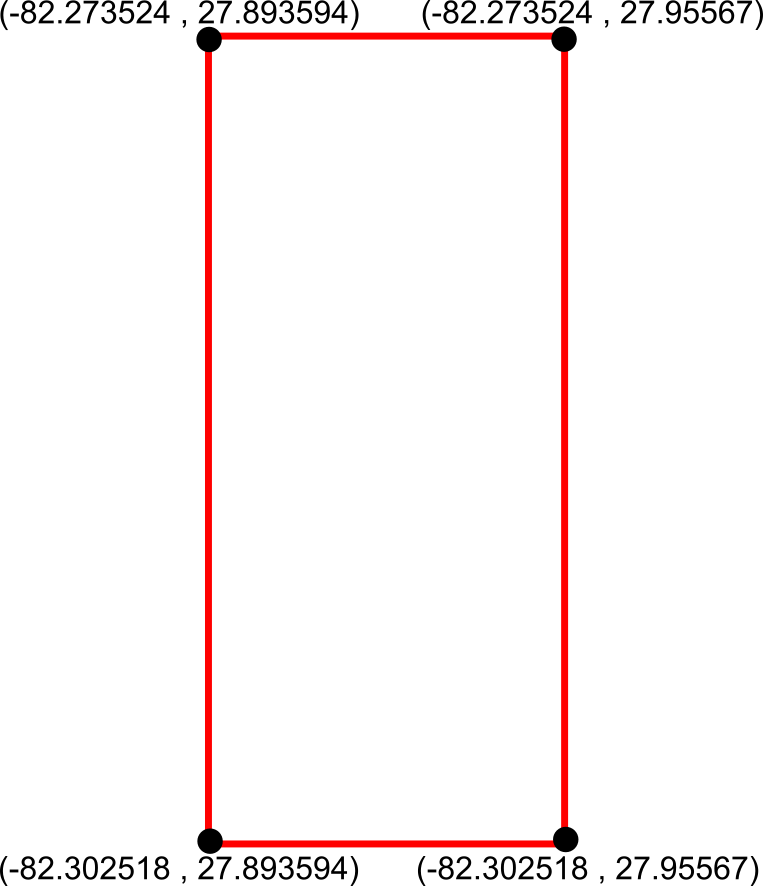
Alright so we now have our bounding boxes for our cities, but we can’t use those points quite yet — right now we just have the top, left, right, and bottom points separately:
What we need to do is reformat those points into actual coordinates for the bounding box, like so:
We can achieve this by using the JsonGet() function, which can return values for specific properties of a valid JSON string. This is useful to us because the GeoBoundingBox() function we used before returns the top, left, right, and bottom points in a JSON-like string that we can easily parse for this step.
Here’s the Qlik script we can use to parse those points into actual coordinates:
So now that we have these coordinates, we can aggregate the box coordinates into a center point using the GeoGetPolygonCenter() function, which will take the given area and output a centered point coordinate.
Here’s the script we can use for this:
[Centered Placenames]:
Load *
  , KeepChar(SubField([City Centroid], ',', 1), '0123456789.-') as [City Centroid Long]
  , KeepChar(SubField([City Centroid], ',', 2), '0123456789.-') as [City Centroid Lat]
;
Load
    [City]
  , GeoGetPolygonCenter([Box Formatted]) as [City Centroid]
Resident [Formatted Box];

Drop Table [Formatted Box];
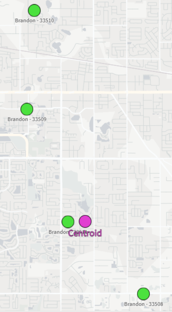
This will result in the center points for each city. We also split out the Lat/Long fields into separate fields for easier use in the map:
City
City Centroid
City Centroid Lat
City Centroid Longitude
Apollo Beach
[-82.399753,27.770687]
27.770687
-82.399753
Brandon
[-82.288021,27.9094739069767]
27.9094739069767
-82.288021
Sun City
[-82.480954,27.67449]
27.67449
-82.480954
And now we can view our city-centered points on a map:
And there we have it! It’s not the perfect centering we may have expected but that could be due to the map projection that we’re using or the specificity of the coordinates we chose. Either way, this is a great way to be able to aggregate several coordinates down to their center point.
One of my biggest annoyances when it comes to cleaning data is needing to make a transformation that is seemingly super easy but turns out to be much more involved when it comes time to implement. I’ve found that while Qlik is not immune to these scenarios, you can very often script your way to a solution.
One of these common snafus is having to unpivot a table. Or…pivot it? Perhaps un-unpivot?
Let’s look at an example of how to pivot and then unpivot a table using Qlik script.
The Example
I first create a new app in Qlik Sense SaaS (though this all works exactly the same if using Qlik Sense on-prem). I am going to pull in the Raleigh Police Incidents (NIBRS) dataset, provided freely to the public via the city’s ArcGIS Open Data portal; here’s the link to the data:
Here’s our load script to bring in the table from a CSV file:
Notice the fields on lines 16-20 that begin with “reported” — these appear to be the same date field but with slightly different formats and granularity. Let’s check it out:
Just as we suspected. Now, what if we wanted to pivot (or “transpose”) those fields into just two fields: one for the field names and one for the field values? This can be done in either the Data Manager or the Data Load Editor. When scripting in the load editor, we use the Crosstable() function.
To do this, I’m going to choose to do this pivot with only the date fields and the unique ID field, which in this case is the [OBJECTID] field:
Our crosstable load looks like this:
This screenshot shows that, on lines 3-9, we are loading our key and date fields from the [Data] table we already loaded in. Then, on line 2, we use the Crosstable prefix and include 3 parameters:
[Date Field] is the field that will be created to hold the field names that appear on lines 4-9.
[Date Value] is the field that will be created to hold the field values from the fields on lines 4-9.
1 indicates that I only want to pivot the date fields around the first loaded field in this table, which is [OBJECTID] in this case. If this was 2, for example, then this operation would pivot the table around [OBJECTID] and [reported_date].
When we run this script, Qlik first loads the data from the CSV into the [Data] table, and then pivots (“crosstables”) the date fields around the key field, [OBJECTID], into a new table called [Dates].
We now see why we did this operation in a separate table and did not include all of the other fields – the pivot predictably increases the number of rows the app is now using:
Here’s what we now have:
Notice how the [Date Field] now holds all of those column names and the [Date Value] field now has those column values. We have successfully turned this:
…into this:
But what if our data had started out in a “pivoted” format? Or what if we want to simply unpivot that data?
The Solution
In order to unpivot the table, we’ll use a Generic Load and some clever scripting.
First, I’ll write the Generic Load:
This screenshot shows that I am using the [OBJECTID] field as my key, [Date Field] as the field names (“attributes”; these will be turned into separate columns), and [Date Value] as the field values (these will become the values for those separate columns).
Here’s the resulting schema:
We now have our data back in the column/value orientation we want, but we have an annoying issue: the resulting tables don’t auto-concatenate. We instead get a separate table for each unpivoted field.
Let’s write some script to always join these tables together without having to write a separate JOIN statement for each table:
Each line of this script is doing the following:
This line creates a new empty table called [Un-unpivoted] with only our key field, [OBJECTID].
*blank*
This line begins a For loop that starts with the number of loaded tables in our app up to this point (NoOfTables()-1) and then decrements (step -1) down to zero (to 0).
Here, inside the For loop, we set the variable vCurrentTable to the table name of the current loaded table index. This just means that every table loaded into the app at this point can be identified by the index at which they were loaded or joined. The first table loaded is 0, the next one is 1, etc. This order changes if that first table is joined with another table later on, though.
*blank*
Here, we check to see if the current table name begins with “Unpivoted.”, which is what our Generic Load tables are prepended with.
If the current table indeed begins with “Unpivoted.”, then we Resident the table with all of its fields and join it to the [Un-unpivoted] we created on line 1.
Now that we’ve joined our table into our master [Un-unpivoted] table, we can drop it from our data model.
This ends our IF statement.
This takes us to the next table index.
Here’s a table that shows the operations for each iteration:
Once we run this, we can see in the resulting table that we were successful!