Qlik doesn’t really allow for icons. When creating dashboards in Qlik Cloud, it can be very helpful to add icons to spruce up KPIs, titles, and tables. There are hundreds of use cases for adding some visual flair using icons, but it can be cumbersome to add icons to objects in Qlik because there are very few built-in icon options.
So, how can we go about adding some icons to our dashboards in an easy and expressive way?
We can use a font! But wait, we’re talking about icons, not text. So how will a font help us? It turns out that fonts can pack in far more than just standard characters like letters, numbers, and punctuation. One example of a “supercharged” font is Tabler Icons.
Tabler Icons is an open source project that bundles thousands of beautiful icons into multiple formats that you can use freely in your web projects. One such format is a webfont, specifically .tff which is a TrueType font type.
How can we use this font in Qlik?
We’ll add it to a custom Qlik theme and choose icons in our dashboard using variable expansion with a parameter.
Don’t worry if this doesn’t quite make sense yet! Let’s go through each step now.
Steps to set up
Download Tabler Icon webfont.
We can find the tabler-icons.ttf font file in the Tabler Icons Webfont package on the NPM website:
If you don’t already have a custom theme to add this font to, go ahead and create one based on the instructions laid out on the Qlik Help website. You can also look online for a Qlik theme generator to help get you started.
Add tabler-icons.ttf to the Qlik theme folder.
Move the tabler-icons.ttf file to your custom Qlik theme folder. It should look similar to this:
Add @font-face to the theme CSS file.
Open your theme’s .css file and add this snippet at the top:
ℹ️ Note that in our screenshot above, my snippet includes the Open Sans font, as I want for that to be the primary font for normal characters like letters and numbers. You can replace that with any of the default Qlik Cloud font options:
Upload file to Qlik Cloud or Qlik Sense Client-Managed.
To add your custom theme to Qlik, you must first save the theme folder as a ZIP file.
In the box that appears, click on the hex value to copy it:
Go to the app Sheet view and switch the app theme to use our uploaded theme.
In your Qlik app, select any Qlik object, and then choose an expression property.
For example, you can create or select a bar chart object and then open the expression editor for the Title expression.
In the property’s expression editor, we’ll use dollar-sign expansion with our GetTablerIcon variable and use the our copied Tabler Icon hex code as the parameter.
Make this the expression:
=$(GetTablerIcon(ea59)) & ' Sales by County'
– Then select the Apply button to save that.
You should now see your icon in the chart title!
If your icon doesn’t appear or you see a placeholder character in the chart title where our icon should be, you probably just need to update the font property.
To do this, go to the chart styling tab:
Find the font property we want to change (Title in this example) and then choose the option that includes Tabler Icons:
ℹ️ Note that if you want to “pair” the Tabler Icons font with a primary font that regular characters will use, refer back to step 5.
Summary
You should now be able to use Tabler Icons anywhere in a Qlik dashboard that supports text expressions and changing the font!
That should get you very far.Try changing the font color and size to see how the icons scale very well and can be recolored just like text.
In today’s fiercely competitive business landscape, data has moved beyond the realm of simple record-keeping to become the very engine of strategic advantage. Organizations that can effectively harness the insights hidden within their data streams are demonstrably more agile, innovative, and ultimately, more successful. However, the journey towards becoming a truly data-driven organization is not merely about deploying sophisticated analytics platforms. It requires a fundamental shift in culture, a deep-seated commitment that permeates every level of the organization, from the executive suite to individual contributors. This comprehensive guide will navigate the essential steps involved in cultivating a robust data-driven culture, underscoring its profound benefits and illuminating the critical role of people, processes, and technology in this transformative endeavor.
Laying the Foundation: Identifying Key Pain Points and Opportunities
The initial and foundational stage in building a data-driven culture involves a collaborative and thorough effort to pinpoint the specific areas within the organization where data can exert the most significant positive influence. This process extends beyond simply identifying obvious operational bottlenecks or areas of inefficiency. It necessitates engaging stakeholders from across all departments – sales, marketing, operations, finance, customer service, and beyond – to understand their unique challenges and the questions they struggle to answer with existing information. For instance, the marketing team might grapple with understanding which campaigns yield the highest return on investment, while the sales team might lack clarity on the characteristics of their most successful leads. Operations could be struggling with unpredictable supply chain disruptions, and customer service might be reactive rather than proactively addressing potential issues.
Furthermore, the focus should not solely be on rectifying problems. A truly data-driven mindset actively seeks opportunities where data can fuel innovation, enhance the customer experience in meaningful ways through personalization, optimize the allocation of resources across various initiatives, and even identify entirely new business models. By involving a diverse range of perspectives, organizations can uncover a broader spectrum of both pain points ripe for data-driven solutions and untapped opportunities waiting to be unlocked. Prioritizing these identified areas based on their potential impact on key business objectives and the practical feasibility of implementing data-driven solutions will ensure that initial efforts are strategically aligned and deliver tangible value, fostering early buy-in and demonstrating the power of a data-centric approach.
Empowering Solutions: Leveraging Data to Solve Problems and Drive Innovation
Once the key pain points and promising opportunities have been identified, the next crucial step involves strategically applying various methodologies of data analysis to extract meaningful insights and drive tangible improvements. This encompasses a spectrum of analytical techniques, each suited to answering different types of questions. Descriptive analysis provides a historical overview of what has occurred, offering valuable context. Diagnostic analysis delves deeper, seeking to understand the underlying reasons and correlations behind observed trends. Predictive analysis leverages historical data and statistical modeling to forecast future outcomes and anticipate potential challenges or opportunities. Finally, prescriptive analysis goes beyond prediction by recommending specific actions and interventions to achieve desired results.
For example, if a sales team is struggling with high customer churn, diagnostic analysis might reveal specific customer segments or interaction patterns that are strong indicators of attrition. Predictive modeling could then forecast which current customers are most likely to churn, allowing for proactive intervention. Prescriptive analytics could even recommend targeted strategies, such as personalized offers or enhanced support, to mitigate this risk. Similarly, in product development, analyzing customer feedback data (both structured and unstructured) can provide invaluable insights into unmet needs, guiding the creation of innovative new features or products. The process of leveraging data for problem-solving and innovation is iterative, requiring a willingness to formulate hypotheses, rigorously test them against available data, and refine analytical approaches based on the evidence uncovered. Embracing a culture of experimentation, including A/B testing different data-driven strategies, is essential for validating their effectiveness and fostering a continuous cycle of improvement and learning.
Cultivating Data Fluency: The Cornerstone of a Data-Driven Culture
The successful and sustainable embedding of a data-driven culture within an organization fundamentally relies on cultivating a high degree of data fluency across all levels of its workforce. This does not imply that every employee needs to become a data scientist or possess advanced statistical expertise. Instead, it signifies fostering a widespread comfort level in working with data, enabling individuals to understand basic data concepts, interpret visualizations, formulate relevant questions based on data, and confidently utilize data-backed insights in their daily decision-making processes. The specific levels of data literacy required will naturally vary depending on individual roles and responsibilities. However, a foundational understanding of data privacy, ethical data usage, and the ability to critically evaluate data sources are essential for everyone.
Organizations can adopt a multi-pronged approach to elevate data literacy. This includes implementing comprehensive training programs tailored to different skill levels and roles, creating easily accessible internal resources such as data glossaries, style guides for data interpretation, and case studies showcasing successful data application. Mentorship programs that pair data experts with colleagues seeking to enhance their skills can also be highly effective. A critical element is ensuring that data is presented in an accessible and understandable manner for non-technical users, often through user-friendly dashboards and intuitive data visualization tools that abstract away unnecessary complexity. Leadership plays a pivotal role in championing data literacy initiatives by actively demonstrating the value of data in their own decision-making processes, visibly supporting training efforts, and fostering an environment where asking data-related questions is not only encouraged but expected. Ultimately, nurturing a culture of intellectual curiosity, where employees are empowered to explore data and seek evidence-based answers, will solidify data fluency as a core organizational competency and drive widespread adoption of data-driven practices.
Equipping Your Team: Choosing and Implementing the Right Data Tools
The strategic selection and effective implementation of appropriate data tools are critical enablers of a data-driven culture. The right tools can democratize access to data, empower users to perform their own analyses, and streamline the process of generating insights. When evaluating potential data tools and platforms, organizations should consider several key criteria. Usability for a diverse range of users, regardless of their technical proficiency, is paramount. Seamless integration capabilities with existing systems and data sources are essential to break down silos and ensure data accessibility. Scalability to handle growing data volumes and evolving analytical needs is crucial for long-term viability. Robust security features are non-negotiable to protect sensitive data and ensure compliance with relevant regulations. Finally, the overall cost-effectiveness of the tools, considering both initial investment and ongoing maintenance, must be carefully evaluated.
Platforms like Qlik Cloud offer a powerful and versatile suite of capabilities designed to foster a data-driven environment. Their intuitive and interactive data visualization tools empower users to create insightful dashboards and reports with minimal technical expertise, while their robust data integration features facilitate the connection and harmonization of data from disparate sources. Features such as collaborative analytics enable teams to work together on data exploration and insight generation, and embedded analytics capabilities allow for the seamless integration of data insights into existing applications and workflows. However, simply selecting the right tools is only part of the equation. Successful adoption necessitates a well-planned implementation strategy, comprehensive training programs to ensure users can effectively leverage the tools’ features, and ongoing support to address any technical challenges or user questions. Furthermore, establishing clear data governance policies and procedures is essential to ensure the quality, accuracy, and trustworthiness of the data being utilized within these tools, fostering confidence and driving adoption.
Conclusion: Embracing Data as the Engine of Success
In conclusion, the journey towards building a truly robust and impactful data-driven culture requires a holistic and sustained effort that encompasses people, processes, and technology. By systematically identifying key pain points and opportunities, empowering data-driven solutions, cultivating widespread data fluency across the organization, strategically selecting and implementing the right data tools, and diligently sustaining the momentum through continuous learning and leadership commitment, organizations can transform data from a latent asset into the very engine of their success, driving innovation, enhancing efficiency, fostering deeper customer understanding, and ultimately achieving a significant and sustainable competitive advantage in today’s data-rich world.
Navigating the world of data analytics can feel like trying to decipher an ancient language. You know the potential is there – those hidden insights that can propel your business forward – but unlocking them often requires a skilled guide. That’s where a data analytics consulting partner comes in. But just like choosing the right travel companion, finding the right partner can make all the difference between a smooth journey and a frustrating detour.This isn’t just about someone setting up a dashboard and calling it a day. A true partner becomes an extension of your team, deeply understanding your unique challenges and working collaboratively to achieve your specific goals. So, what should you really expect from this kind of relationship?
What Should You Be Receiving? It’s More Than Just Deliverables.
When you engage a data analytics consulting partner, you’re not just buying a service; you’re investing in expertise and a collaborative relationship. Here are some key things you should expect to receive:
Flexibility That Fits Your Needs: Forget rigid contracts and pre-packaged solutions. A good partner understands that your needs can evolve. Expect pre-authorized hours that provide budget control while allowing for necessary work to be completed. Think of it as setting a clear boundary, like saying, “Let’s scope this project within 40 hours, and if we need more, we’ll talk.” This demonstrates respect for your budget and ensures transparency. Furthermore, look for flexible service level agreements (SLAs). These shouldn’t be one-size-fits-all. A partner should be willing to tailor SLAs – perhaps a standard four-hour response time for typical requests, which might even adjust to a quicker 30-minute response during critical periods – all tied to clearly defined scopes of work and agreed-upon hourly rates. This adaptability shows they’re truly invested in supporting your business rhythm.
A Consistent and Dedicated Point of Contact: Imagine having to explain your project to a new person every time you reach out. Frustrating, right? Expect a dedicated, 1:1 relationship where you work with a consistent team that builds a deep understanding of your business, your data, and your Qlik Cloud environment. This eliminates the inefficiencies of multiple touchpoints and the impersonal feel of large, impersonal firms relying on offshore subcontractors who may not have the same level of direct investment in your success. You deserve a team that’s in the trenches with you, not just filling out timesheets from afar.
Proactive Partnership, Not Just Order-Taking: A great consulting partner doesn’t just wait for you to tell them what to do. They should be proactive, bringing insights and suggestions to the table based on their understanding of your business and the capabilities of Qlik Cloud. Expect regular check-ins – not just status updates, but strategic conversations about progress, potential roadblocks, and future opportunities. They should be genuinely invested in understanding your specific business goals and tailoring their approach to help you achieve them.
Signs You Might Need a New Qlik Consulting Partner: Don’t Settle for Less.
Are you getting everything you should be from your current data analytics partner? Here are some red flags that might indicate it’s time for a change:
Silence is Not Golden: A lack of proactive communication or consistently missed deadlines are clear indicators that your partner isn’t prioritizing your needs. You shouldn’t have to constantly chase them for updates or feel like your project is on the back burner.
Quote Chaos: Receiving inaccurate quotes or having to constantly request updated pricing signals a lack of attention to detail and can lead to budget surprises. Transparency in pricing is crucial for building trust.
The Price Doesn’t Feel Right: Be wary of price gouging, an unfortunately common practice in technology sales, especially within sectors like state and local government. A trustworthy partner will be upfront and transparent about their pricing and licensing models, ensuring you’re paying a fair market value for the Qlik Cloud products and services. They should be working to get you the best value, not just maximizing their profit at your expense.
Where’s the Innovation?: If your partner isn’t bringing innovative solutions or demonstrating a deep understanding of the latest Qlik Cloud features and how they can benefit your specific industry, you might be missing out. A good partner stays ahead of the curve and helps you do the same.
They Don’t “Get” Your Business: A partner who doesn’t take the time to understand the unique nuances and challenges of your specific industry is less likely to deliver truly impactful solutions. Generic advice won’t cut it.
The Feeling’s Not Mutual: Ultimately, if you feel like your current partner isn’t truly invested in your success, isn’t communicative, or isn’t providing the level of service you expect, it’s a strong sign that it might be time to explore other options.
The Value of Industry Expertise: Why It Matters.
While a broad understanding of data analytics is essential, a partner with proven experience in your specific industry can bring invaluable insights. For example, Arc analytics specializes in education, healthcare, and government sectors, where we’ve developed a deep understanding of the unique data challenges and regulatory landscapes. However, our experience isn’t limited to these verticals. Our history of completing hundreds of projects across several sectors demonstrates our adaptability and ability to apply our Qlik Cloud expertise to diverse business needs. This cross-industry experience allows us to bring best practices and innovative solutions from different fields to your specific challenges.s
Deliverables: Tailored Solutions Designed for You.
Forget the idea of a one-size-fits-all solution. A quality data analytics consulting partner understands that your needs are unique. Expect solutions that are configured and customized to the specific scope of work you define. This means the dashboards, reports, and integrations you receive are designed to answer your specific business questions and track your key performance indicators. While the underlying technology might be consistent, the final deliverables should feel like they were built for you, not just for anyone. We also believe in transparent reporting when it comes to accounting, so you have a clear understanding of the investment you’re making.
Finding the Right Fit: It’s About More Than Just Technology.
Choosing a data analytics consulting partner is a significant decision. It’s about finding a team that not only possesses the technical expertise with Qlik Cloud but also prioritizes clear communication, genuine collaboration, and a deep understanding of your business. You deserve a partner who feels like a natural extension of your own team, dedicated to helping you unlock the full potential of your data. Ready to explore how a dedicated and experienced Qlik Cloud partner can help you achieve your data analytics goals? We invite you to reach out and discover the difference a true partnership can make.Contact our team.
While the Qlik platform has maintained and supported libraries developer libraries in JavaScript and .NET/C# for several years, they have more recently released a library for interacting with Qlik in Python. They call it the Platform SDK, which is also available as a TypeScript library.
The Python library is essentially a set of Python classes and methods that mirror the structures and functions of the Qlik QRS and Engine APIs, also providing some conveniences around authentication and WebSocket connections. The library is open for anyone to download and use thanks to its permissive MIT license.
The use cases for the Qlik Python SDK include being able to write automation scripts for repetitive admin tasks, load app and object data into a Pandas dataframe, and even creating reports built off of app or log data.
Installing the library is very simple — just make sure you are using at least Python 3.8:
python3 -m pip install --upgrade qlik-sdk
Let’s look at some examples of how we can use the library. Below, we import a few classes from the qlik_sdk library and then create some variables to hold our Qlik Cloud tenant URL and API key. We’ll use the API key to authenticate with a bearer token but an OAuth2.0 implementation is also available. Learn how to generate an API key here. The tenant URL and API key are then used to create an Apps object, which provides some high-level methods for interacting with app documents in Qlik Cloud.
from qlik_sdk import Apps, AuthType, Config# connect to Qlik enginebase_url ="https://your-tenant.us.qlikcloud.com/"api_key ="xxxxxx"apps = Apps(Config(host=base_url, auth_type=AuthType.APIKey, api_key=api_key))
Now that we’ve got our authentication situated, let’s add some code to interact with a Qlik app and its contents. First, let’s import a new class, NxPage, which describes a hypercube page (more about Qlik hypercubes here). Then let’s create a new function, get_qlik_obj_data(), to define the steps for getting data from a Qlik object, like a table or bar chart. In this function, we can take an app parameter and an obj_id parameter to open an WebSocket connection to the specified app, get the app layout, get the size of the object’s hypercube, and then fetch the data for that hypercube:
from qlik_sdk.apis.Qix import NxPageapp = apps.get("xxxxxxxx-xxxx-xxxx-xxxx-xxxxxxxxxxxx")def get_qlik_obj_data(app: NxApp, obj_id: str) ->list:"""Get data from an object in a Qlik app."""# opens a websocket connection against the Engine API and gets the app hypercubewith app.open(): tbl_obj = app.get_object(obj_id) tbl_layout = tbl_obj.get_layout() tbl_size = tbl_layout.qHyperCube.qSize tbl_hc = tbl_obj.get_hyper_cube_data("/qHyperCubeDef", [NxPage(qHeight=tbl_size.qcy, qWidth=tbl_size.qcx, qLeft=0, qTop=0)], )return tbl_hcobj_data = get_qlik_obj_data(app=app, obj_id="xxxxxx")
This code would end up returning a list of data pages, something like this:
The cell value is shown as 282 in the qText property. We may note, though, that we can’t readily identify the field that this value represents.
Let’s add some code to make the resulting dataset include the fields for each cell value. We can do that by adding a get_ordered_cols_qlik_hc() function to get the ordered list of columns in each of these NxCellRows items.
This function will ultimately take a straight hypercube as an argument and do the following:
Get the list of dimensions and measures and then combine them into one list.
Reorder that list to match the correct column order as defined in the hypercube’s qColumnOrder property.
Return that ordered column list.
Then in our get_qlik_obj_data() function, we use our new get_ordered_cols_qlik_hc() function to get our columns. From there we iterate through each row of each data page in the hypercube and create a new dictionary object for each cell and then adding those dictionaries to a list for each row.
New and updated code shown in bold:
from qlik_sdk.apis.Qix import NxPage, HyperCubedef get_ordered_cols_qlik_hc(hc: HyperCube) ->list:"""get ordered columns from Qlik hypercube."""# get object columns dim_names = [d.qFallbackTitle for d in hc.qDimensionInfo] meas_names = [m.qFallbackTitle for m in hc.qMeasureInfo] obj_cols = dim_names.copy() obj_cols.extend(meas_names)# order column array to match hypercube column order new_cols = [] new_col_order = hc.qColumnOrderfor c in new_col_order: new_cols.append(obj_cols[c])return new_colsdef get_qlik_obj_data(app: NxApp, obj_id: str) ->list:""""""# opens a websocket connection against the Engine API and gets the app hypercubewith app.open(): tbl_obj = app.get_object(obj_id) tbl_layout = tbl_obj.get_layout() tbl_size = tbl_layout.qHyperCube.qSize tbl_hc = tbl_obj.get_hyper_cube_data("/qHyperCubeDef", [NxPage(qHeight=tbl_size.qcy, qWidth=tbl_size.qcx, qLeft=0, qTop=0)], ) hc_cols = get_ordered_cols_qlik_hc(tbl_layout.qHyperCube)# traverse data pages and store dict for each row hc_cols_count =len(hc_cols) tbl_data = []for data_page in tbl_hc:for rows in data_page.qMatrix: row = {hc_cols[i]: rows[i].qText for i inrange(hc_cols_count)} tbl_data.append(row)return tbl_dataobj_data = get_qlik_obj_data(app=app, obj_id="xxxxxx")
This will get us the desired field: value format that will allow us to better analyze the output, like so:
One of the toughest aspects of dealing with freeform data is that the input layer may not have proper data validation processes to ensure data cleanliness. This can result in very ugly records, including non-text fields that are riddled with incorrectly formatted values.
Take this example dataset:
[Test Data] table
RecordID
DurationField
1
00:24:00
2
00:22:56
3
00:54
4
0:30
5
01
6
4
7
2:44
8
5 MINUTES
9
6/19
Those values in the [DurationField] column are all different! How would we be able to consistently interpret this field as having a Interval data type?
One of the ways you might be inclined to handle something like this is to use If() statements. Let’s see an example of that now.
It’s a mess! Qlik has to evaluate each Interval#() function twice in order to, first, check to see if the value was properly interpreted as a duration (“interval”) value, and then, second, to actually return the interpreted duration value itself.
One of the nice alternative ways of handling this is to use a different conditional function, like Alt(). This function achieves the same thing as using the If() and IsNum() functions in conjunction. You can use:
The preceding load happening at the bottom of that script is there to do some basic standardization of the [DurationField] field so that it’s easier to pattern-match.
In the rest of the script, we’re using the Alt() function (Qlik Help page) to check whether its arguments are numeric type of not. Each of its arguments are Interval#() functions, which are trying to interpret the values of the [DurationField] field as the provided format, like 'hh:mm:ss' or 'm:s'.
So it’s basically saying:
If Interval#([DurationField], 'hh:mm:ss') returns a value interpreted as an Interval, then return that value (for example, 00:24:00). But if a value couldn’t be interpreted as an Interval (like 5 mins for example, where the Interval#() function would return a text type), we go to the next Interval#() function. If Interval#([DurationField], 'mm:ss') returns a value…
This should all result in a table that looks like this:
In this post, I want to look at how to use a few of the built-in Qlik GeoAnalytics functions that will allow us to manipulate and aggregate geographic data.
Specifically, we are going to look at how to calculate a bounding box for several grouped geographic points, reformat the result, and then calculate the centroid of those bounding boxes. This can be a useful transformation step when our data has geographic coordinates that you need to have aggregated into a single, centered point for a particular grouping.
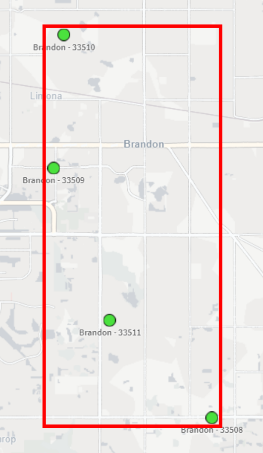
In our example, we have a small dataset with a few records pertaining to Florida locations. It includes coordinates for each Zip Code that is within the city of Brandon. Our goal is to take those four coordinates, aggregate them into a single, centered point, and then return that point in the correct format for displaying it in a Qlik map object.
Here’s our data, loaded from an Inline table:
[Data]:
Load * Inline [
State   ,   County          ,   City            ,   Zip     ,   Lat         ,   Long
FL      ,   Hillsborough    ,   Apollo Beach    ,   33572   ,   27.770687   ,   -82.399753
FL      ,   Hillsborough    ,   Brandon         ,   33508   ,   27.893594   ,   -82.273524
FL      ,   Hillsborough    ,   Brandon         ,   33509   ,   27.934039   ,   -82.302518
FL      ,   Hillsborough    ,   Brandon         ,   33510   ,   27.955670   ,   -82.300662
FL      ,   Hillsborough    ,   Brandon         ,   33511   ,   27.909390   ,   -82.292292
FL      ,   Hillsborough    ,   Sun City        ,   33586   ,   27.674490   ,   -82.480954
];
Let’s see what happens when we load this data and create a new map that has a point layer, using City as the dimension and the Lat/Long fields as the location fields:
What we may notice here is that the city of Brandon does not show up on the map — this is because the dimensional values for the point layer need to have only one possible location (in this case, one lat/long pair). Since Brandon has multiple Lat/Long pairs (one for each Zip Code), the map can’t display a single point for Brandon.
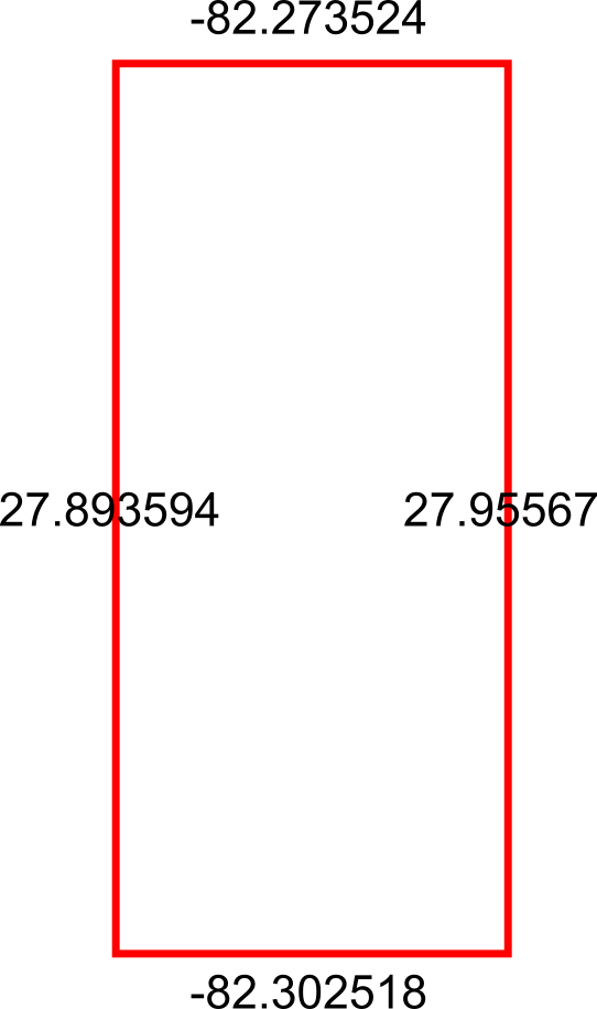
Okay, so let’s get the bounding box so that we can use it to get the center-most point. This is ultimately what we want our bounding box to be:
To do this in Qlik we’ll use the GeoBoundingBox() function, which calculates the smallest possible box that contains all given points, as shown in the example image above.
Here’s the script we can use in the Data Load Editor:
[Bounding Boxes]:
Load
    [City]
  , GeoBoundingBox('[' & Lat & ',' & Long & ']') as Box
Resident [Data]
  Group By [City]
;
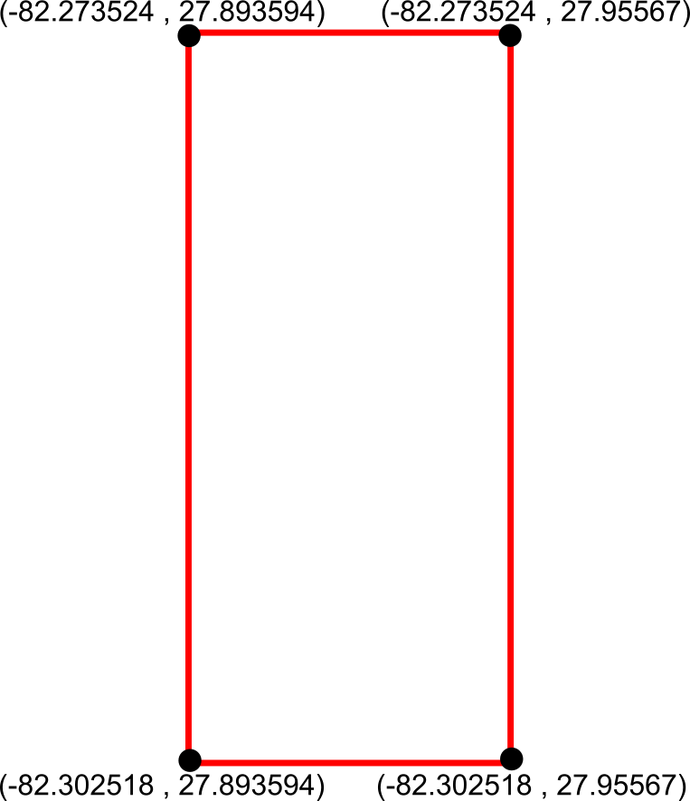
Alright so we now have our bounding boxes for our cities, but we can’t use those points quite yet — right now we just have the top, left, right, and bottom points separately:
What we need to do is reformat those points into actual coordinates for the bounding box, like so:
We can achieve this by using the JsonGet() function, which can return values for specific properties of a valid JSON string. This is useful to us because the GeoBoundingBox() function we used before returns the top, left, right, and bottom points in a JSON-like string that we can easily parse for this step.
Here’s the Qlik script we can use to parse those points into actual coordinates:
So now that we have these coordinates, we can aggregate the box coordinates into a center point using the GeoGetPolygonCenter() function, which will take the given area and output a centered point coordinate.
Here’s the script we can use for this:
[Centered Placenames]:
Load *
  , KeepChar(SubField([City Centroid], ',', 1), '0123456789.-') as [City Centroid Long]
  , KeepChar(SubField([City Centroid], ',', 2), '0123456789.-') as [City Centroid Lat]
;
Load
    [City]
  , GeoGetPolygonCenter([Box Formatted]) as [City Centroid]
Resident [Formatted Box];

Drop Table [Formatted Box];
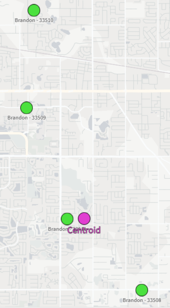
This will result in the center points for each city. We also split out the Lat/Long fields into separate fields for easier use in the map:
City
City Centroid
City Centroid Lat
City Centroid Longitude
Apollo Beach
[-82.399753,27.770687]
27.770687
-82.399753
Brandon
[-82.288021,27.9094739069767]
27.9094739069767
-82.288021
Sun City
[-82.480954,27.67449]
27.67449
-82.480954
And now we can view our city-centered points on a map:
And there we have it! It’s not the perfect centering we may have expected but that could be due to the map projection that we’re using or the specificity of the coordinates we chose. Either way, this is a great way to be able to aggregate several coordinates down to their center point.
One of the most-utilized features of web browsers is the bookmark; everyone has their favorite sites saved for later, but that’s really their only function – to navigate you. What if you wanted to have a bookmark that, instead of simply taking you to another webpage, could dynamically make changes to the page you’re currently on? You may be thinking, “oh, you mean browser extensions?” Yes, those absolutely fall into that category of functionality and purpose, but here’s a special type of bookmark you may not have known about: the JavaScript bookmarklet.
A JavaScript bookmarklet is a browser bookmark that runs JavaScript code instead of just navigating you to a webpage. They start with the javascript: quasi-protocol rather than the usual http:// or https:// protocol that we’re used to seeing. These bookmarkets are created the same way you create regular bookmarks and also live in your bookmark bar or folders.
I’ve written a few bookmarklets to make a couple of repetitive or annoying Qlik tasks easier. Let’s look at one of my favorites.
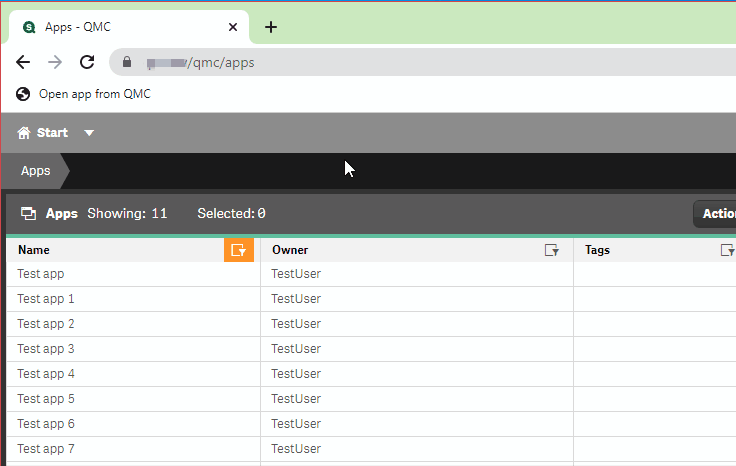
Opening an app from the QMC
If you’re a Qlik Sense on Windows poweruser like me, then you live both in the QMC and the Hub. For tasks that involve me duplicating other developers’ apps, finding and opening generically-named apps, or opening apps where I have access to the app but not the stream, the usual way I’ve accessed those apps is to just copy/paste an already-opened app’s URL and then copy/paste in the new app’s AppID.
Enter this handy little bookmarklet: all you have to do is select a table row in the Apps section of the QMC and then click on the bookmark and it will automatically open the selected app in a new tab!
Below is the full, annotated code for this bookmark, as well as a compressed, shortened version:
How do I make this a bookmark in my browser?
Below are the steps for adding this as a bookmark in your browser — note that I am using the Brave browser, which has similar settings as Google Chrome and Microsoft Edge. If the instructions don’t match the browser that you’re using, do a quick web search on how to add a bookmark to your browser. You should be able to pick it up at step 3 below.
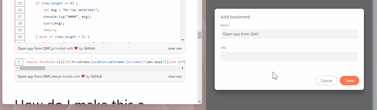
Select your browser’s main pane, find the Bookmarks option, and then select the Bookmark manager option.
Find the menu button and select the Add new bookmark option.
Name the bookmark Open app from QMC.
In the URL field, type in javascript:.
Go to the second code chunk from above (the one with only one line), select all of the text, copy it, and then paste it into the URL field next to where you typed javascript: in the bookmark page.
After you hit the Save button shown in the above GIF, your new bookmarket should be ready to use!
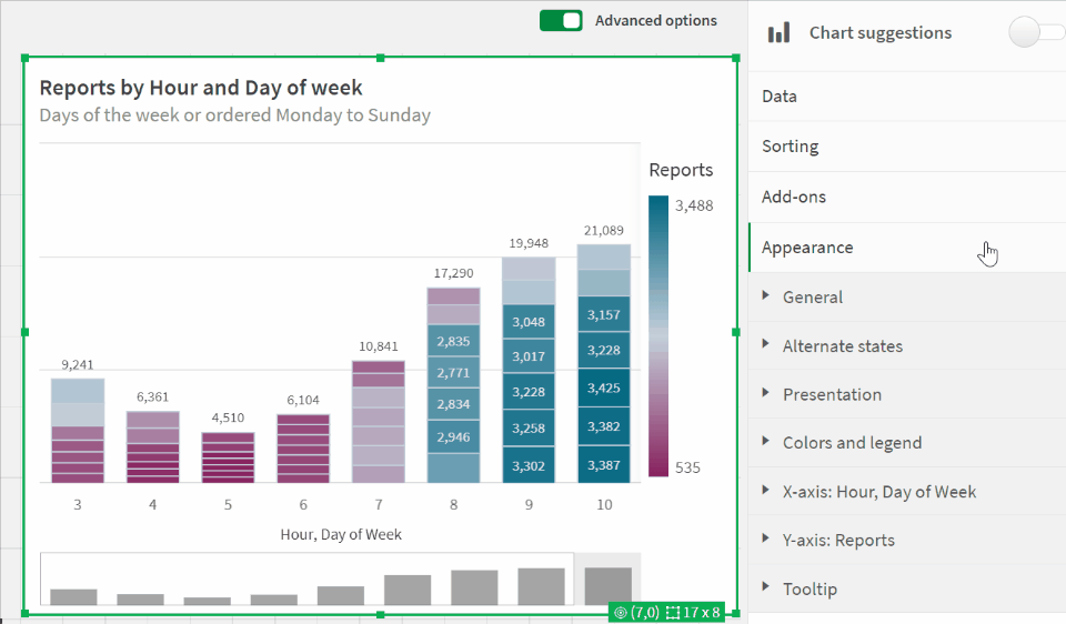
The latest update to Qlik Cloud includes some great updates, continuing the trend of getting more styling options, something I’ve always wanted more of. This update gives up font family, size, and color for bar chart axes — see a quick glance at the updates in this GIF:
One of my biggest annoyances when it comes to cleaning data is needing to make a transformation that is seemingly super easy but turns out to be much more involved when it comes time to implement. I’ve found that while Qlik is not immune to these scenarios, you can very often script your way to a solution.
One of these common snafus is having to unpivot a table. Or…pivot it? Perhaps un-unpivot?
Let’s look at an example of how to pivot and then unpivot a table using Qlik script.
The Example
I first create a new app in Qlik Sense SaaS (though this all works exactly the same if using Qlik Sense on-prem). I am going to pull in the Raleigh Police Incidents (NIBRS) dataset, provided freely to the public via the city’s ArcGIS Open Data portal; here’s the link to the data:
Here’s our load script to bring in the table from a CSV file:
Notice the fields on lines 16-20 that begin with “reported” — these appear to be the same date field but with slightly different formats and granularity. Let’s check it out:
Just as we suspected. Now, what if we wanted to pivot (or “transpose”) those fields into just two fields: one for the field names and one for the field values? This can be done in either the Data Manager or the Data Load Editor. When scripting in the load editor, we use the Crosstable() function.
To do this, I’m going to choose to do this pivot with only the date fields and the unique ID field, which in this case is the [OBJECTID] field:
Our crosstable load looks like this:
This screenshot shows that, on lines 3-9, we are loading our key and date fields from the [Data] table we already loaded in. Then, on line 2, we use the Crosstable prefix and include 3 parameters:
[Date Field] is the field that will be created to hold the field names that appear on lines 4-9.
[Date Value] is the field that will be created to hold the field values from the fields on lines 4-9.
1 indicates that I only want to pivot the date fields around the first loaded field in this table, which is [OBJECTID] in this case. If this was 2, for example, then this operation would pivot the table around [OBJECTID] and [reported_date].
When we run this script, Qlik first loads the data from the CSV into the [Data] table, and then pivots (“crosstables”) the date fields around the key field, [OBJECTID], into a new table called [Dates].
We now see why we did this operation in a separate table and did not include all of the other fields – the pivot predictably increases the number of rows the app is now using:
Here’s what we now have:
Notice how the [Date Field] now holds all of those column names and the [Date Value] field now has those column values. We have successfully turned this:
…into this:
But what if our data had started out in a “pivoted” format? Or what if we want to simply unpivot that data?
The Solution
In order to unpivot the table, we’ll use a Generic Load and some clever scripting.
First, I’ll write the Generic Load:
This screenshot shows that I am using the [OBJECTID] field as my key, [Date Field] as the field names (“attributes”; these will be turned into separate columns), and [Date Value] as the field values (these will become the values for those separate columns).
Here’s the resulting schema:
We now have our data back in the column/value orientation we want, but we have an annoying issue: the resulting tables don’t auto-concatenate. We instead get a separate table for each unpivoted field.
Let’s write some script to always join these tables together without having to write a separate JOIN statement for each table:
Each line of this script is doing the following:
This line creates a new empty table called [Un-unpivoted] with only our key field, [OBJECTID].
*blank*
This line begins a For loop that starts with the number of loaded tables in our app up to this point (NoOfTables()-1) and then decrements (step -1) down to zero (to 0).
Here, inside the For loop, we set the variable vCurrentTable to the table name of the current loaded table index. This just means that every table loaded into the app at this point can be identified by the index at which they were loaded or joined. The first table loaded is 0, the next one is 1, etc. This order changes if that first table is joined with another table later on, though.
*blank*
Here, we check to see if the current table name begins with “Unpivoted.”, which is what our Generic Load tables are prepended with.
If the current table indeed begins with “Unpivoted.”, then we Resident the table with all of its fields and join it to the [Un-unpivoted] we created on line 1.
Now that we’ve joined our table into our master [Un-unpivoted] table, we can drop it from our data model.
This ends our IF statement.
This takes us to the next table index.
Here’s a table that shows the operations for each iteration:
Once we run this, we can see in the resulting table that we were successful!
If there’s one thing I’ve learned in my time using, learning, and teaching about Qlik Sense, it’s that there’s so much I’ve used but haven’t fully memorized. This is the case with Qlik script functions, section access formatting, QRS API, and plenty more. Since I’m always Googling and looking things up on the Qlik Help site, I decided to maximize my efficiency with some Google Chrome shortcuts.
Before, my searching workflow was to open a new Chrome tab, navigate to the Qlik Help search page, and then run my search from there. Not that arduous or time-consuming, but we can get faster!
Now, from the Chrome search bar (officially called the “Omnibox”), I can start my query with :q and then enter my search keywords. When I hit enter, I’m taken directly to the Qlik Help search results for those keywords!
Here’s how to do it:
Go to the browser settings and then go to the Search engine section.
Select the Manage search engines and site search option and then find the section called Site search.
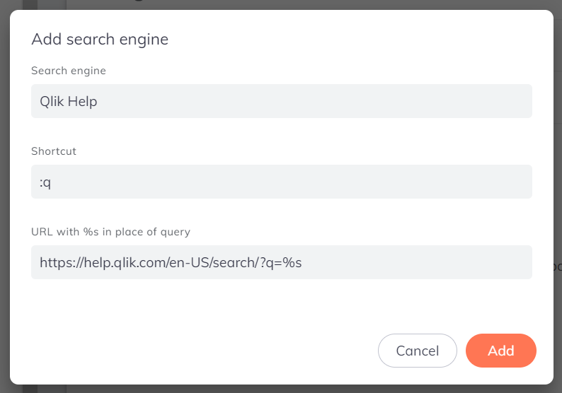
Select the Add button and then fill in the boxes like this:
Search Engine: Qlik Help
Shortcut: :q
URL with %s in place of query: https://help.qlik.com/en-US/search/?q=%s
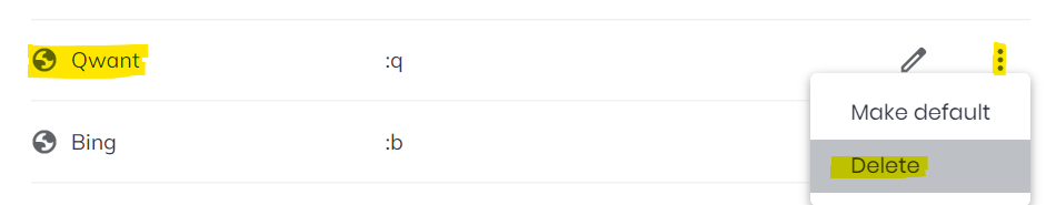
Note that if you get an error about the shortcut being invalid, you may have another search engine shortcut that’s already using the :q shortcut. Click the Cancel button and check the list of search engines above this section. If there’s a conflicting one, you can edit it or delete it:
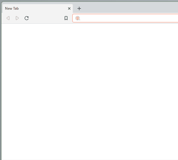
Once you successfully add the Qlik Help shortcut, you can try it by opening a new tab, clicking into the browser search bar, typing “:q”, hitting the space bar, typing your search keywords, and then hitting the Enter key on your keyboard:
We’re getting pretty efficient over here! Let’s use another keyboard shortcut to really kick things into high gear: CTRL + L. Use that keyboard shortcut to focus your cursor to the browser search bar without having to click into it first:
Okay…but what if we were really in a hurry to get our Qlik Help fix? Let’s add a final keyboard shortcut to the mix here: ALT + ENTER. This shortcut will open the search results in a new tab for us so that we don’t have to navigate away from our current page:
Arc Analytics is a full-service data analytics and integration consultancy based in Charlotte, NC, USA, specializing in the Qlik platform. Browse the posts below for practical Qlik tips, migration guidance, and real-world use cases from our consulting work.


")


")