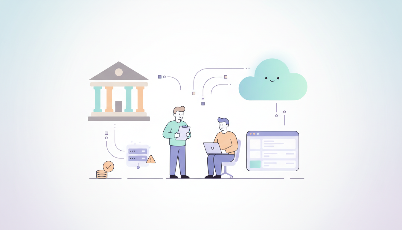
State and local government agencies face a difficult choice in 2026. Many departments still run on software and hardware from ten or twenty years ago. These systems are often called legacy systems. While it might seem cheaper to keep using what you already own, the truth is the opposite. Staying on old platforms is actually more expensive and more dangerous than moving to something new.
When an organization uses outdated technology, they pay a hidden tax every single day. This tax comes in the form of slow work, high repair bills, and the constant fear of a system crash. Modern platforms like Qlik Cloud have changed the math. Today, moving to the cloud is the safest way to protect public funds and keep services running for citizens.
The Real Price of Legacy Systems
Many leaders think that keeping an old system saves money because there is no new purchase price. However, the cost to keep an old system running grows every year. In 2026, the parts needed for old servers are hard to find. The power needed to run old data centers is expensive. Most importantly, the people who know how to fix these systems are retiring.
When the only person who knows how to fix a critical database leaves, the agency is in trouble. Hiring a specialized consultant to fix an old system can cost three times more than a modern staff member. This creates a situation where the government is spending more money just to stay in the same place.
Comparing Costs: Old vs. New
To understand why Qlik Cloud saves money, we have to look at where the money actually goes. Legacy systems have many “invisible” costs that do not show up on a single receipt.
Expense Category
Legacy On-Premise Systems
Qlik Cloud Modernization
Hardware
High costs for servers and cooling
Zero hardware costs
Maintenance
Constant manual patching and fixes
Automatic updates by Qlik
Staffing
Requires rare, expensive specialists
Uses standard modern data skills
Security
High risk of gaps in old software
Enterprise-grade cloud security
Speed
Days or weeks to get a new report
Minutes to see live data
As the table shows, the shift to Qlik Cloud removes the heavy lifting of physical hardware. This allows the budget to go toward actual data analysis instead of just keeping the machines plugged in.
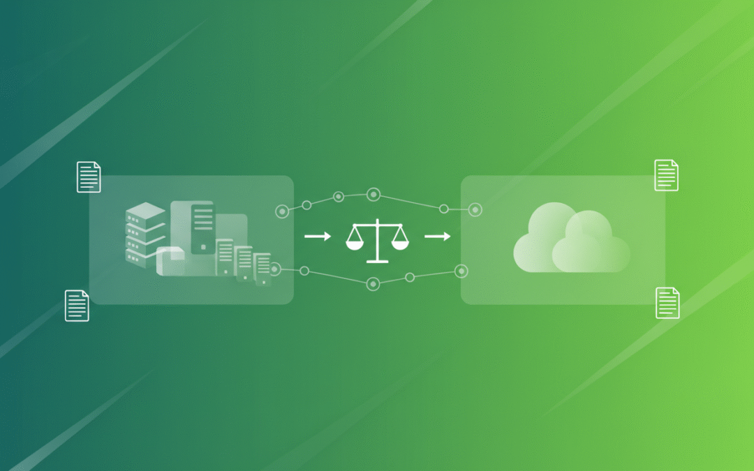
The Risk of Technical Debt with Legacy Systems
Technical debt is a term for the work you skip today that you will have to pay for later with interest. For a local government, technical debt looks like a pile of old software that no longer talks to new programs. In 2026, data needs to move fast. If a city needs to track emergency response times or school budgets, they cannot wait for an old system to “crunch the numbers” overnight.
Old architecture is also a target for cyber attacks. Hackers look for old systems because they are easier to break into. A single security breach can cost a county millions of dollars in legal fees and recovery. When you look at it this way, the “free” old system is actually a massive financial liability.
The Danger of Knowledge Silos in Legacy Systems
A knowledge silo happens when only one or two people understand how a system works. In many state offices, the entire data process lives inside the head of one employee. If that person gets a new job or retires, the office loses its ability to function.
Qlik Cloud solves this by being easy to use and well-documented. It uses a simple interface that a new employee can learn in a few days. This means the agency is no longer held hostage by old, complicated code that nobody understands.
Why Qlik Cloud is the Right Choice in 2026
Qlik has spent years perfecting its cloud platform for the public sector. It is not just a tool for making charts. It is a complete system for managing data from start to finish. For a government agency, this means they can connect all their different departments into one view.
One of the biggest benefits is the ability to see data in real time. In the past, a state agency might only see their budget health once a month. With Qlik, they can see it every hour. This helps leaders make better choices before a small problem becomes a big, expensive disaster.
Simple Data Architecture
The way data moves in a modern system is much simpler than in the old days. Below is a basic look at how Qlik Cloud simplifies the journey of information.
Legacy Workflow (Complex and Slow): Old Database -> Manual Export -> Spreadsheet -> Email -> Manual Cleanup -> Old Reporting Tool -> Outdated Report
Qlik Cloud Workflow (Simple and Fast): All Data Sources -> Qlik Cloud Automated Integration -> Real-Time Dashboard -> Instant Insights for All Users
By removing the middle steps, the organization saves hundreds of hours of staff time every year. That time can be spent serving the public instead of fighting with spreadsheets.
Saving Money Through Efficiency
When a government moves to Qlik Cloud, the savings show up in several areas. First, the IT department no longer has to buy expensive servers every three years. Second, the software is always up to date, so there are no “surprise” upgrade fees.
Third, and most importantly, the agency becomes more efficient. If a department can find a way to save 5% on their energy bill or 10% on their supply chain because they have better data, that pays for the software many times over. This is why modernization is a smart financial move. It provides the “eyes” to see where money is being wasted across the whole organization.
Better Security for Less Effort
Security is a major concern for any government body. Keeping an old system secure requires constant manual work. You have to check for holes, apply patches, and monitor for intruders. Qlik Cloud handles all of this automatically. They have teams of experts whose only job is to keep the data safe. This gives local governments the same level of protection as a giant corporation without the giant price tag.
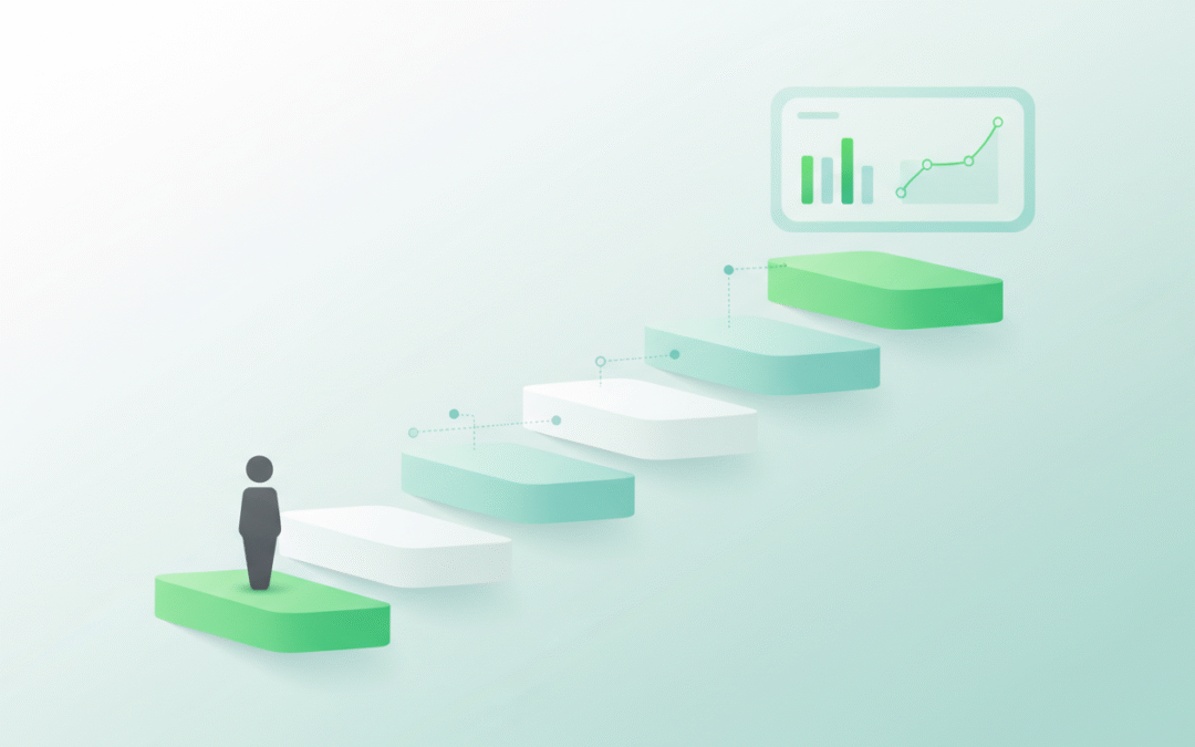
Taking the First Step Toward Modernization
Moving to the cloud does not have to happen all at once. Many successful organizations start with one department, like Finance or Public Works. Once they see how much time and money they save, they move the rest of the agency over.
The most important thing is to stop waiting. The risks of staying on legacy systems are growing every day. In 2026, the technology is ready, the security is proven, and the cost savings are clear.
If you want to learn more about how to start this journey, you can visit our services page to see how we help government groups transition to the cloud. You can also read about government data standards to see why modern architecture is now the requirement for public offices.
Conclusion: The Future is Modern
The goal of any state or local government is to serve the people well. It is hard to do that when you are held back by tools from the past. By choosing Qlik Cloud, agencies can lower their risks, support their people better, and save taxpayer money.
The transition away from legacy systems is not just a technical update. It is a way to make sure the government is ready for the challenges of the future. Don’t let outdated architecture drain your budget and slow down your mission. The move to a modern platform is the best investment a public leader can make in 2026.
There is a painful truth about Qlik Cloud scalability that most people do not want to talk about. If you have spent any time in the world of business intelligence, you have likely heard the whispers. People worry that moving to the cloud means losing control over performance. They fear that as their data grows and their user base expands, the system will eventually hit a wall that they cannot move.
The painful truth is not that Qlik Cloud cannot scale. The painful truth is that most teams scale the wrong things first. They scale their app count, their reload frequency, and their user permissions without a plan. Then, when things slow down, they blame the platform.
In reality, Qlik Cloud offers scalability strengths that often surpass what is possible in a traditional Qlik Sense on-premises environment. The secret is understanding how to use those strengths correctly. This post explores the reality of scaling in Qlik Cloud and how it compares to the old way of doing things.
If you are planning a major growth phase or a migration, we can help you sanity check your approach at Arc Qlik Consulting Services.
The Real Reason People Doubt Qlik Cloud Scalability
When a team says Qlik Cloud does not scale, they are usually reacting to symptoms of a deeper issue. Scalability doubt usually starts when one of these things happens:
Dashboards begin to feel sluggish as more users log in simultaneously.
Reload windows become crowded and lead to frequent failures.
The number of apps grows so fast that nobody knows which one is the source of truth.
Governance becomes a bottleneck that stops new projects from moving forward.
These are not platform failures. These are scaling symptoms. They are almost always caused by design choices rather than platform limits. The shift from Qlik Sense on premises to Qlik Cloud requires a shift in how you manage growth.
What Scalability Actually Means in Qlik
To scale effectively, you have to measure the right things. Scalability is not just one number. It is a combination of several different dimensions that all need to grow together.
User scalability – Add more people without breaking access or performance.
Data scalability – Handle more volume and history without creating bloated apps.
App scalability – Support more dashboards without duplication and chaos.
Reload scalability – Refresh data reliably as your frequency grows.
Governance scalability – Maintain standards without blocking your teams.
Scalability Dimensions and What to Measure
Dimension
What Grows
What Usually Breaks First
What to Monitor
Users
Adoption across roles
Permissions and content sprawl
Spaces, roles, and app ownership
Data
History and granularity
App size and reload time
App size and reload duration
Apps
Number of published apps
Duplicate logic and inconsistent KPIs
App inventory and reuse rates
Reloads
Frequency and scheduling
Reload queue conflicts
Reload windows and failure rates
Governance
Teams and domains
Slow approvals and bottlenecks
Space design and publishing flow
The Reframe: Why Qlik Cloud is Actually Stronger
The painful truth is that many teams bring their old Qlik Sense habits into Qlik Cloud. They lift and shift their apps without redesigning their operating model. When you treat a cloud platform like a folder of files on a local server, scalability will always look bad.
Qlik Cloud is designed to be a governed product platform. When you use it that way, it scales much more cleanly than an on-premises environment. You no longer have to worry about scaling servers, managing nodes, or performing manual upgrades. The platform handles the infrastructure so you can focus on the data.
Qlik Cloud vs Qlik Sense: Scalability Differences
The way you scale in Qlik Cloud is fundamentally different from Qlik Sense on premises.
Infrastructure Ownership In Qlik Sense, scaling often means adding more hardware. You have to manage nodes, load balancing, and maintenance effort. In Qlik Cloud, that infrastructure management shifts away from your team. You scale by adjusting your plan and your app design rather than your server rack.
Standardization and Governance Qlik Cloud encourages the use of spaces and shared content patterns. This makes it easier to maintain standards as you grow. Qlik Sense environments often evolve into a collection of isolated apps that are difficult to govern at scale.
Growth Path Expanding in Qlik Cloud is a matter of configuration. You add capacity and features as your needs grow. Expanding an on-premises environment often requires a full project involving hardware procurement and software upgrades.
Qlik Cloud vs Qlik Sense Scalability at a Glance
Topic
Qlik Cloud
Qlik Sense (On Prem)
Scaling Effort
Focus on configuration and design
Focus on infrastructure and design
Growth Friction
Governance and app sprawl
Hardware limits and upgrades
Operations
Tenant-level management patterns
Server and node management patterns
Slowdown Causes
App design and reload strategy
App design and hardware constraints
Common Scalability Mistakes and How to Fix Them
Most scalability issues come down to a few common mistakes.
Mistake 1: The Giant App Many teams try to put every possible metric into a single massive app. As the data grows, the app becomes slow, and the reloads become fragile. The Fix: Split your apps by domain and audience. Use a curated data layer so multiple apps can share the same foundation without duplicating the data.
Mistake 2: Logic Duplication When every app has its own version of a “Gross Margin” calculation, you cannot scale. Eventually, the numbers will stop matching. The Fix: Standardize your business logic. Use shared resources and master items so that a change in one place updates everywhere.
Mistake 3: Competing Reload Schedules If every app is set to reload at 8:00 AM, your reload queue will spike, and failures will follow. The Fix: Stagger your reloads. Align the frequency with the actual business need. Not every app needs to refresh every hour.
A Simple Scalability Roadmap
Scaling is a journey that happens in phases. You do not need enterprise-level governance on day one, but you do need a path to get there.
Phase 1: The Pilot Focus on proving value with a small set of apps. Establish naming standards and a basic space model early. This prevents chaos from taking root.
Phase 2: Departmental Rollout Define a clear publishing workflow. Create a repeatable process for how data is moved and how apps are promoted from development to production.
Phase 3: Enterprise Scale Formalize ownership by business domain. Introduce app portfolio management to ensure that you are not supporting hundreds of apps that nobody uses.
How to Tell if You Are Scaling the Right Way
You can tell your scalability strategy is working if you see these signals:
Your reload success rates stay stable even as you add more data.
Your app inventory stays organized and easy to navigate.
Business definitions remain consistent across different dashboards.
New teams can join the platform without requiring a custom setup.
Ownership is clearly defined for every app and dataset in the tenant.
Warning Signs vs. Healthy Signals
Area
Warning Sign
Healthy Signal
Apps
Hundreds of near-duplicate apps
Clear reuse of data and logic
Reloads
Frequent failures during peak times
Predictable and staggered schedules
Governance
Everything requires a custom exception
Standard patterns work for most teams
Performance
Users complain that it feels slower
Performance is measured and stable
Conclusion
The painful truth about Qlik Cloud scalability is that it requires discipline. The platform can handle massive amounts of data and thousands of users, but it cannot fix a bad design. When you move away from old on-premises habits and embrace a governed, capacity-based model, Qlik Cloud becomes an incredibly powerful engine for growth.If you want to ensure your Qlik environment is built to last, we can help you design a strategy that scales with your business. Explore our Qlik Consulting Services to learn more.
Try Qlik Cloud for Free
If you want to see how Qlik Cloud scales for yourself, you can start a free 30-day trial. It is the best way to explore the platform, load your own data, and test the features we discussed today without any upfront commitment.
If you are trying to decide between Qlik Sense and Qlik Cloud, licensing is one of the first places to start. It affects how you budget, how you grow, and how you explain costs to finance and leadership.
This post focuses only on licensing. It compares how Qlik Sense (on-prem) and Qlik Cloud Analytics think about users, capacity, and what is included in different plan tiers. Future posts in this series will cover architecture, features, integration, and mobile.
If you need help working through this in your own environment, you can always reach out to us at Arc Qlik Consulting Services.
What We Mean by Qlik Sense vs Qlik Cloud
Before diving into licensing, it helps to clarify the products.
Qlik Sense (On Prem) Qlik Sense in this article refers to the traditional on-premises deployment that you install and manage yourself, either on your own servers or in an infrastructure as a service environment.
Licensing here is traditionally based on:
User types, such as creators versus viewers
Server or site licenses and infrastructure capacity
You mainly think about how many people will create content, how many will consume it, and what hardware you need to run it.
Qlik Cloud Analytics Qlik Cloud Analytics is the software-as-a-service (SaaS) platform that Qlik offers. You do not manage the underlying infrastructure. You subscribe to a plan.
Licensing in Qlik Cloud is based on:
Plan tiers such as Starter, Standard, Premium, and Enterprise
Capacity for data that you analyze, measured in gigabytes
Included features such as reporting, automations, predictive capabilities, app sizes, and access options
You mainly think about how much data you will analyze and what level of capability you need.
User-Based vs Capacity-Based Licensing
At a high level, Qlik Sense and Qlik Cloud use different lenses for licensing.
Qlik Sense (On Prem)
Primary Focus
Users and infrastructure
You typically size around:
Number of professional creators
Number of analyzers or consumers
Number of sites and servers
Monitoring and control
Licensing is enforced through user assignment, access rules, and server capacity
Capacity for data that is loaded and stored for analysis
Plan tier that controls features and limits
You typically size around:
Total volume of data for analysis across your tenant in a year
Which plan level matches your feature needs and growth
Monitoring and control
Admins watch capacity use for data for analysis
Qlik provides alerts as you approach your plan capacity
You can upgrade capacity or move to a higher plan when needed
A simple way to think about it:
Platform
Main Licensing Focus
What You Size Around
Qlik Sense (On Prem)
Users and infrastructure
Creators, viewers, servers
Qlik Cloud Analytics
Capacity and plan tier
Data for analysis, features, scale
Qlik Cloud Plan Tiers and What They Include
The Qlik Cloud Analytics plans are structured into tiers. Below is a summary of what is included in each, based on the current pricing page. This is a functional overview, not a copy of the site content, and not a list of prices.
Qlik Cloud Starter
Designed for small businesses and very small teams.
Key characteristics:
Fixed number of users included
Fixed amount of data for analysis included
No option to purchase extra data capacity beyond what is included
Included capabilities:
Analytics with interactive visualizations and dashboards
AI-powered insight features that come with Qlik Cloud Analytics plans
Standard connectors to hundreds of data sources
Ability to move data into Qlik Cloud for relational and software as a service sources through Qlik Talend Cloud
Sharing and collaboration within the team
Max app size limit on the smaller side, such as 5 GB per app
Community level support
Starter is a good fit for small companies that want to try Qlik Cloud in a contained way.
Qlik Cloud Standard
Designed for small teams and groups that need more flexibility than Starter.
Key characteristics:
Includes user access across the tenant
Starts with a base amount of data for analysis
You can purchase additional capacity in defined increments, such as 25 GB blocks
Included capabilities, in addition to Starter:
Use of unstructured data to drive insight
Report generation and delivery
No code automation builder that can trigger actions across connected systems
Managed and shared spaces that improve governance and collaboration
Personal space for each user, such as 1 GB per user
Augmented analytics that helps users explore data more effectively
24×7 critical support
Standard is typically where many departmental and mid-sized deployments start.
Qlik Cloud Premium
Designed for broader rollout across a business with more advanced requirements.
Key characteristics:
Starts with more data for analysis than Standard
Allows additional capacity to be purchased in larger increments, such as both 25 GB and 250 GB blocks
Included capabilities, in addition to everything in Standard:
Predictive analytics powered by automated machine learning tools
More capacity for generative style capabilities
Anonymous or public access for dashboards and content
Deeper data integration options:
Additional Qlik Talend Cloud data sources including SAP, mainframe, and legacy systems
Seamless extraction from SAP into Qlik Cloud
Data lineage connectors for better visibility into data flows
Higher max app size, such as 10 GB per app
Guided customer success onboarding
Premium is usually a match for organizations that want Qlik Cloud to be a central analytics platform, not just a small team tool.
Qlik Cloud Enterprise
Designed for large enterprises that need maximum scale and flexibility.
Key characteristics:
Starts at a much higher data for analysis capacity
Tailored for large deployments and broader enterprise standards
Included capabilities, in addition to everything in Premium:
More capacity bundled into:
Reporting
Automations
Public or anonymous access
Assistants and predictive models
Dataset sizes and number of models
Larger default app sizes, such as 15 GB, with options to support very large apps, up to tens of gigabytes per app with additional purchases
More personal space per user, such as 3 GB
Multi-region tenants for global deployments
Personalized customer success plans and onboarding
Enterprise is targeted at organizations that want to standardize on Qlik Cloud at scale.
A simple summary table:
Plan
Sized Around
Ideal For
Highlights
Starter
Fixed users and fixed data capacity
Small business, pilots
Core analytics, dashboards, smaller apps, community
Standard
Data capacity expandable in steps
Teams and departments
User access for all, automations, reporting, spaces
Premium
Larger capacity and advanced features
Mid to large organizations
Predictive, more GenAI capacity, public access, SAP
Enterprise
Large capacity and scaled features
Large enterprises
Very large apps, more automations, multi-region, CSP
How Qlik Cloud Measures and Monitors Usage
Qlik Cloud uses a capacity-based model, which Qlik compares to a cell phone plan in the pricing FAQ.
Capacity-based means you pay a fixed fee for a set amount of capacity.
This gives more predictable costs than true consumption models, where monthly bills can swing up and down.
Data for analysis as the main metric
You estimate how much data you will load and store for analysis over a year.
That total is what the plan is sized around.
What happens when you approach capacity
You keep full access to your environment.
You receive alerts as you get close to your limit.
You can choose to:
Upgrade to a higher capacity
Upgrade to a higher plan
Additional charges only appear if you go above the limits of your plan without adjusting it.
How admins monitor usage
Admins can view current capacity use
They can see which apps or datasets are driving usage
They can use this information to plan clean-up, archiving, or upgrades
You can picture it as a progress bar labeled Data For Analysis that moves from comfortable, to approaching the limit, to an upgrade suggested.
Comparing Licensing in Practice
Most teams want to know how this affects real decisions.
How You Think About Sizing
Qlik Sense (On Prem)
You tend to ask:
How many people will build apps, dashboards, and data models
How many people will consume those apps
How many environments and servers you need to support development, test, and production
User types and server footprint drive licensing and infrastructure costs.
Qlik Cloud Analytics
You tend to ask:
How much data will we analyze across all apps over a year
How fast that data volume is likely to grow
Which plan level we need for:
Reporting and scheduled outputs
Automations and triggers
Public access or external users
Predictive capabilities
SAP and advanced lineage
A practical comparison:
Question
Qlik Sense (On Prem)
Qlik Cloud Analytics
How many creators vs viewers do we have
Main sizing driver
Still important but not the main metric
How large are our datasets
Drives hardware requirements
Drives plan and data for analysis capacity
Do we need external or public dashboards
Requires custom patterns or add ons
Included with Premium and Enterprise plans
How large are our apps
Handled through server tuning
Controlled by app size limits by plan tier
Governance and Tenants
Plan tiers in Qlik Cloud also influence:
How many collaboration and managed spaces you use
How much personal space each user has
Whether you can run tenants across multiple regions
The level of onboarding and customer success support that comes bundled
These governance aspects become more important as analytics shifts from a single team to a company-wide platform.
If you are planning a hybrid setup or a staged migration from Qlik Sense to Qlik Cloud, it can be useful to map both licensing models side by side. This is where a short working session with a partner can help. You can learn more about our services at:
There is no single right answer. Both Qlik Sense and Qlik Cloud can make sense, depending on context.
Situations where Qlik Cloud licensing is often attractive:
You want predictable yearly costs based on capacity, not variable month-to-month bills
Your number of viewers is growing quickly and you want to simplify user-based calculations
You plan to take advantage of:
Built in reporting and automated distribution
Automations that trigger actions in other systems
Predictive capabilities that are available in higher tiers
Public or external sharing of dashboards
Situations where Qlik Sense on premises may still be important:
Strong regulatory or residency requirements tied to existing data centers
A heavily tuned on-premises environment that will be part of a long-term migration path
Existing investments in infrastructure that you plan to use for several more years
A common pattern is to run both during a transition period and to move workloads gradually.
How To Start Comparing Licensing For Your Organization
If you are trying to make this decision for your own team, a simple checklist helps.
Inventory your users
How many true creators do you have
How many consumers
Which groups will need access in the next 12 to 24 months
Estimate your data for analysis
Total size of your current analytics datasets
Expected growth over the next few years
How often full reloads or history loads occur
List feature needs
Reporting and scheduled distribution
Automations and workflows
Public or customer-facing dashboards
SAP and complex source systems
Regulatory or residency requirements
Map to models
How this fits with your current Qlik Sense licensing
Which Qlik Cloud plan tier feels like a realistic starting point
You can use the “Compare all plan features” section on the Qlik pricing page to fill in detailed questions for internal review.
If you want a second set of eyes, our team at Arc can help you run concrete scenarios. You can connect with us at Contact Arc.
What Comes Next In The Series
This article focused only on licensing. In the rest of this Qlik Sense vs Qlik Cloud series, we will cover:
Architecture and deployment differences
Feature and capability comparisons
Integration and data movement
Mobile and embedded analytics
If you want to follow along, you can keep an eye on the Qlik category on our blog.
In the meantime, if you are in the middle of a licensing decision or a Qlik Cloud migration and want a simple way to talk it through, we are happy to help.
If you are new to Qlik, it can be hard to know what to do first. You may have access to a Qlik Cloud tenant, or you might be thinking about starting a trial, but you are not sure how to turn that into real progress.
This short beginner roadmap gives you a simple plan for your first week with Qlik. You do not need to learn every feature. You just need a clear place to start, a safe environment to click around in, and a few basic wins to build confidence.
If you want to follow along with a video version, you can pair this guide with our Qlik Beginner Roadmap video as you go.
Before you can learn Qlik, you need a place to practice. This can be a trial, a company tenant, or a sandbox provided by a partner. The key is to have somewhere you can safely build and test without worrying about breaking production reports.
Here are common options:
Option
What It Is
Best For
Qlik Cloud free trial
A 30-day trial of Qlik Cloud Analytics
Individuals and small teams who want to try Qlik
Company Qlik Cloud tenant
Your organization’s existing Qlik Cloud environment
Employees joining an existing analytics program
Partner sandbox
A Qlik environment set up and managed by a consulting partner
Teams that want structure, guardrails, and guidance
If your team needs help choosing between Qlik Cloud options or setting up tenants and spaces, you can explore our Qlik Consulting Services and Qlik Support.
Step 2: Join the Right Learning Resources
Learning Qlik is easier when you are not doing it alone. Good resources give you examples, answers, and a place to ask questions when you get stuck.
These resources will be your support system as you move beyond your first week and into more advanced topics.
Step 3: Get Comfortable With the Qlik Cloud Interface
Once you have access to Qlik Cloud, spend 30 to 60 minutes just exploring the interface. You do not need to build anything complex on day one. The goal is to feel comfortable clicking around.
Here are a few things to look for:
Where you see spaces or streams that hold content.
Where apps are listed and how to open them.
Where to add or upload data, such as an Excel file.
Where sheets and visualizations live inside an app.
Think of this like walking around a new office building. You are not trying to memorize every room. You just want to know where the main areas are and how to get back to the front door.
Your next goal is to get real data into Qlik, even if it is small and simple. An Excel file is a great place to start because it is familiar and easy to control.
You can use a basic file with columns like:
Date
Product
Region
Sales Amount
At a high level, your steps will look like this:
Open Qlik Cloud and go to the space where you are allowed to build.
Create a new app or open an empty starter app.
Choose the option to add data or upload a file.
Select your Excel file and let Qlik read the fields.
Confirm that Qlik shows a simple preview of the table with your columns.
You are not building a full data model or complex transformations here. You are just taking the first step of seeing your own data inside Qlik.
As you get more comfortable, it helps to understand the main pieces inside Qlik Cloud. You do not need every detail, but a simple mental model will make things easier when you work with your team or talk with admins.
Here are four core concepts in plain language:
Concept
Simple Description
Beginner Tip
Spaces / Streams
Areas that hold apps and content for groups of users
Ask which space is safe for your testing and practice
Apps
Containers that hold data, sheets, and visualizations
Start with one app for your first Excel file and charts
Data Connections
Saved links to data sources such as files, databases, or APIs
Begin with a single file before adding more sources
Users and Security
Rules that control who can see and change content
Confirm your role and permissions with your admin
In many organizations, these pieces are part of a broader data strategy that includes integration, governance, and reporting. If you want to see how Qlik fits into that bigger picture, you can explore our Data Strategy Consulting services or industry pages for Healthcare, Government, and Education.
Beginner Checklist: Your First Week With Qlik Cloud
To keep things simple, here is a quick checklist you can use to track your first week. You do not need to do everything in one day. Spread it out and give yourself time to explore.
In your first week:
Join Arc Academy for Qlik on Skool.
Follow Qlik and Arc Analytics on LinkedIn.
Get access to a Qlik environment:
Qlik Cloud trial
Company tenant
Partner sandbox
Log in and explore the Qlik Cloud interface for 30 to 60 minutes.
Load one Excel file as sample data into a new or existing app.
Build one simple bar chart using that data.
Learn where your spaces, apps, data connections, and user settings are managed.
If you can check all these boxes, you are officially started with Qlik. You may not feel like an expert yet, but you have done the most important part: moving from “someday” to hands-on practice.
What Comes Next in Qlik Cloud
After your first week, you can start to:
Add more data sources beyond Excel.
Build multiple sheets and more complex visualizations.
Learn about data modeling and transformations.
Work with IT or a partner on governance, security, and performance.
Your first week with Qlik does not need to be perfect. It just needs to move you closer to clear, useful insight from your data. In our next guide and video, we will walk through the most common mistakes beginners make with Qlik and how you can avoid them.
If you have heard the name Qlik but are not sure what it does or whether it fits your needs, this guide will help. Qlik is a business intelligence tool that helps people see and understand their data. It is used by companies in many industries to make better decisions faster.
This post will explain what Qlik is, what it does, and who uses it. By the end, you will have a clearer picture of whether Qlik might be a good fit for your team.
Qlik is a software platform that turns raw data into visual dashboards and reports. Instead of looking at rows and columns in a spreadsheet, you can see charts, graphs, and maps that show patterns and trends.
The main goal of Qlik is to help people answer questions about their business. Questions like:
Which products are selling the most?
Where are we losing customers?
How long does it take to complete a process?
What is our revenue this quarter compared to last year?
Qlik pulls data from different sources, such as databases, spreadsheets, and cloud apps. It then organizes that data so you can explore it, filter it, and share it with others. You do not need to be a data scientist to use Qlik. If you know what questions you want to answer, Qlik can help you find the answers.
Qlik does three main things: it connects to your data, it helps you explore that data, and it lets you share what you find.
1. Connect to Your Data
Qlik can pull data from many places. This includes databases like SQL Server, cloud tools like Salesforce, spreadsheets like Excel, and even web APIs. Once connected, Qlik brings all that data into one place so you can see the full picture.
2. Explore and Analyze
Qlik uses something called associative analytics. This means you can click on any part of a chart or table, and Qlik will show you how that selection relates to everything else. For example, if you click on a region, you can instantly see sales, customers, and products for that region. You do not have to build a new report every time you have a new question.
3. Share Insights
Once you build a dashboard or report, you can share it with your team. People can view it on their computer, tablet, or phone. They can also interact with it, filtering and exploring on their own. This makes it easier for everyone to stay on the same page.
Qlik is used by people in many different roles and industries. Here are some of the most common groups:
Business Leaders and Executives
Leaders use Qlik to see high-level metrics in one place. They can track revenue, costs, customer satisfaction, and other key numbers without waiting for a monthly report. Qlik helps them make faster, more informed decisions.
Managers and Department Heads
Managers use Qlik to monitor team performance, spot problems, and plan ahead. For example, a sales manager might use Qlik to see which reps are hitting their targets and which products are lagging. An operations manager might use it to track delivery times or inventory levels.
Analysts and Data Teams
Analysts use Qlik to dig deeper into data and find insights. They build dashboards, run reports, and answer questions from other teams. Qlik gives them a flexible tool to explore data without writing complex code.
Frontline Staff
Frontline workers use Qlik to see simple, focused views that guide their daily work. For example, a nurse might use a Qlik dashboard to see patient wait times, or a warehouse worker might use it to see order status.
Which Industries Use Qlik?
Qlik is used across many industries. Here are a few examples:
There are many business intelligence tools available. Here are a few reasons why companies choose Qlik:
Associative analytics: Qlik lets you explore data freely without being locked into a fixed path.
Fast performance: Qlik can handle large amounts of data and still respond quickly.
Cloud and on-premise options: You can run Qlik in the cloud or on your own servers.
Strong community: Qlik has a large user community, lots of training resources, and many partners who can help.
If you are comparing Qlik to other tools, it helps to think about your specific needs. What questions do you want to answer? Who will use the tool? How much data do you have? These questions will guide your choice.
Join a community: Connect with other Qlik users to ask questions and learn from their experience. Arc Academy for Qlik on Skool
Get support: If you need help with setup, training, or building dashboards, reach out to a Qlik partner. Arc Qlik Consulting Services
Start small: Pick one or two questions you want to answer. Build a simple dashboard. Learn as you go.
You do not need to master everything on day one. The most important thing is to start exploring and see how Qlik can help your team make better decisions.For more guidance, you can also check out our post on How To Get Started With Qlik in 2026.
Arc Analytics is a full-service data analytics and integration consultancy based in Charlotte, NC, USA, specializing in the Qlik platform. Browse the posts below for practical Qlik tips, migration guidance, and real-world use cases from our consulting work.